How to nail the gallery wall, interior’s most chic new trend
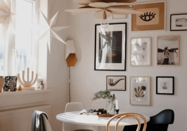
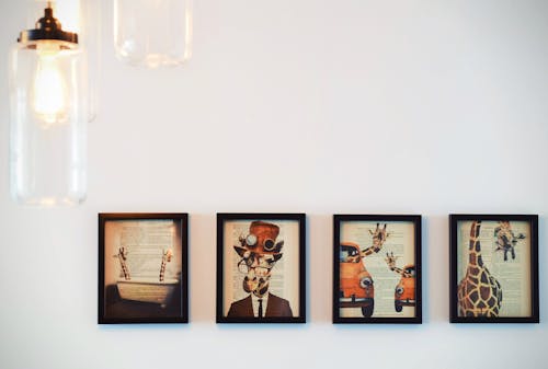
One of the biggest trends that we’ve seen coming through in home ware and décor, is the eye-catching, but difficult to pull off gallery wall. The perfectly chic way to spice up a bland room or to add character to a basic space, the gallery wall has many forms and styles – but it’s important to find one that works for you and your home.
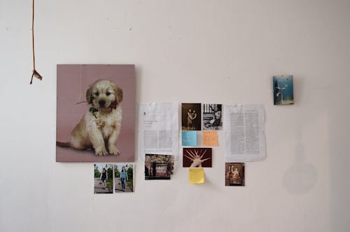
While some of the gallery walls you see may look random, higgeldy piggeldy and even disorganised, trust us, there’s a lot of thought that goes into each piece, position and frame – because a gallery wall only works effectively as a design element when there is cohesion and a well-thought-out plan.
We’ve compiled our top tips for making your gallery wall an eye-catcher and not an eye-sore so you can elevate your space as easily as possible.
Pick your favourite things
A lot of people make the mistake of trying to pick a colour scheme first and end up limiting themselves to prints and artwork that they don’t necessarily love because they’re trying to fit pieces in with that exact shade of blue they’ve chosen.
By picking up pieces you like and collecting them, you’ll begin to see a theme emerge naturally – you are the theme! You may find yourself gravitating to loud, buoyant, vibrant pieces or maybe a more vintage feel will come through. Either way, it’s about displaying pieces that make you feel happy. You can edit later if certain pieces don’t fit and find somewhere else for those.
Texture adds a lot
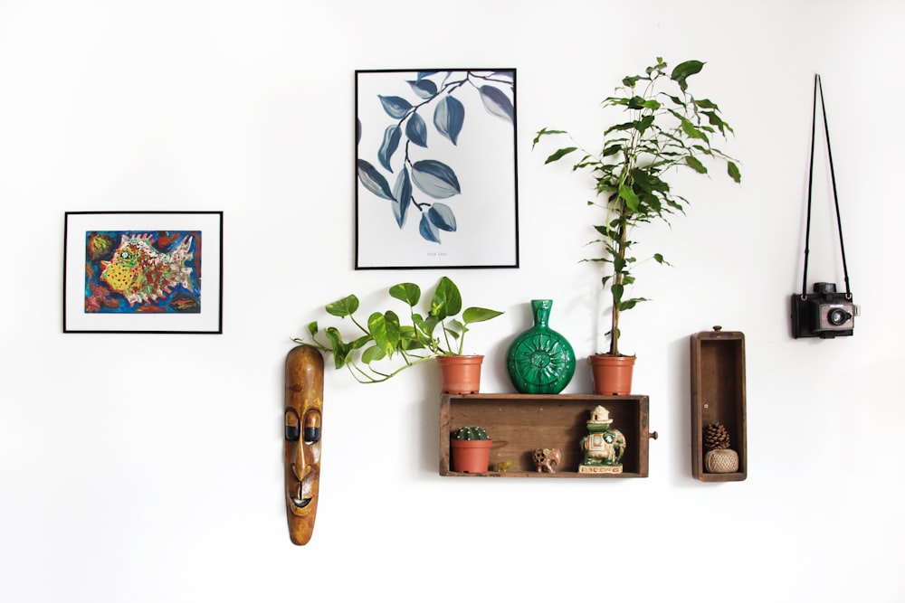
Don’t just stick to print and photos, even if that’s the traditional look. Get creative with your pieces! There’s a real resurgence of macramé happening right now ad woven pieces too with the 70s coming back in interior trends – try out some more natural textures scattered along your gallery wall just to mix things up a little.
Sculptures can do this too, with ceramics, clay, welded metals – whatever catches your eye! Don’t be afraid to experiment and get playful with it. The possibilities are endless and texture is something that you can actually switch in and out of the wall to keep up with the seasons – something more natural and woven in summer and bright metallics for winter!
Use the rule of three

This may seem a little counter-intuitive to the advice given in the first idea, but this is for once you have actually collected the artwork you want to use. The rule of three is about how aesthetically pleasing things tend to come in threes. There’s something about the balance of it that we enjoy, so the same thing applies here.
I’m not talking just having three frames or pieces – I’m talking themes and colours. If you are seeing certain themes and ideas coming out in your gallery wall, try to narrow it down to three major themes. A lot of people like to play with black and white and add in an additional colour to make it all pop. This isn’t to say your pieces should only contain these colours – but at least one of them should be a major part of each piece on your wall.
Plan your design

This is the most important step of all. Drawing up a mock up of how you’d like your gallery walls to look will affect the frames you buy, the size prints you order and how many item you have in the mix. Sketching out a few ideas with rough proportions will really help when it’s time to hammer in those nails and frame stickers! You know what they say: Measure twice, cut once!
Cover photo: @momo_interior


