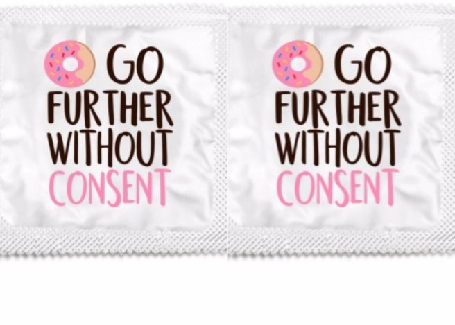
Sorry, what? This poorly designed condom is confusing the internet
So, as examples of poorly executed graphic designs go, we reckon this condom wrapper may be at the top of the list.
One reddit user shared an image of a condom which had been handed out on a college campus, appearing to be branded with the words “Go further without consent” alongside a picture of a rather out-of-place donut.
And as you can probably guess, the image sparked outrage among social media users.
“Who approved this?” one wrote, while another asked: “How did they arrive at this final product?”
Unless given out by Dunkin Donuts I don't get why there's a donut on a condom wrapper. My brain didn't translate it at all.
— FormerGregSamsa (@MJaMitchell) September 9, 2017
The people who signed off on this design aren't qualified to do anything more complex than stare out a window. pic.twitter.com/GldSU2T9RZ
— Gabriel Morton (@gabrielenguard) September 9, 2017
The wrapper is literally telling people to continue with sexual acts whether their partner has consented or not, right?
Well, not quite.
See, the little donut in front on the text actually stands for the words 'Do Not' (apparently), and is part of Say It With a Condom's Consent range.
While the addition of those two, all-important words completely change the message, no one can be blamed for thinking it meant quite the opposite.
We're glad it's all cleared up, but to be honest, we're really struggling to understand how the condom even made it into the production in the first place.


